Semiconductor Data Analysis Example
Integrated Circuits (ICs) used in electronic products are manufactured on semiconductor wafers, where each die on the wafer goes through a series of tests at the end of the manufacturing process to determine if it is good for shipment or not (called wafer sort/binning). The percentage of die that is good for shipment is called Yield.
In this example, we illustrate a hypothetical case where a team has an yield issue, identifies the underlying root-cause using data analysis and visualizations, designs an experiment to solve the problem, and successfully verifies that they have improved the yield / process metrics using hypothesis testing.

Fig 1. Semiconductor Wafers, Source: wikipedia
In the following sections, we cover the following:
- Generating mock-data for the problem
- Exploring the yield issue using various visualizations in R
- Mock-experiment design to address the yield issue/improve the process
- Analyzing the results of the experiment using various visualizations
- Hypothesis-testing to verify we actually improved desired metrics
- Conclusions
Yield Definition and Criteria
In this example, each part is tested with 6 tests (T01 to T06). A good die is defined as a die that passes all 6 tests. The passing criteria for the tests are as displayed in the table below.
# Define a dataframe from scratch using test names and limits provided
df_limits <- setNames(data.frame(matrix(ncol = 4, nrow = 0)),
                      c("TestName", "LowerLimit", "UpperLimit", "Units"))
df_limits <- rbind(
  df_limits,
  data.frame(
    TestName = 'T01_RES',
    LowerLimit = NA,
    UpperLimit = 100,
    Units = "mOhm"
  )
)
df_limits <- rbind(
  df_limits,
  data.frame(
    TestName = 'T02_VTH',
    LowerLimit = 0.6,
    UpperLimit = 1.2,
    Units = "Volts"
  )
)
df_limits <- rbind(
  df_limits,
  data.frame(
    TestName = 'T03_IOFF',
    LowerLimit = NA,
    UpperLimit = 1e-7,
    Units = "Amps"
  )
)
df_limits <- rbind(
  df_limits,
  data.frame(
    TestName = 'T04_IG_3V',
    LowerLimit = NA,
    UpperLimit = 5e-4,
    Units = "Amps"
  )
)
df_limits <- rbind(
  df_limits,
  data.frame(
    TestName = 'T05_IG_4V',
    LowerLimit = NA,
    UpperLimit = 5e-4,
    Units = "Amps"
  )
)
df_limits <- rbind(
  df_limits,
  data.frame(
    TestName = 'T06_IG_5V',
    LowerLimit = NA,
    UpperLimit = 5e-4,
    Units = "Amps"
  )
)

# Generate a pretty table from the data frame
kable(df_limits) %>%
  kable_styling(
    bootstrap_options = "striped",
    full_width = F,
    position = "center"
  ) %>%
footnote(general = 'NA: Limit Not Applicable')| TestName | LowerLimit | UpperLimit | Units |
|---|---|---|---|
| T01_RES | NA | 1.0e+02 | mOhm |
| T02_VTH | 0.6 | 1.2e+00 | Volts |
| T03_IOFF | NA | 1.0e-07 | Amps |
| T04_IG_3V | NA | 5.0e-04 | Amps |
| T05_IG_4V | NA | 5.0e-04 | Amps |
| T06_IG_5V | NA | 5.0e-04 | Amps |
| Note: | |||
| NA: Limit Not Applicable |
Generating mock-data
This notebook is based on a fictitious semiconductor data set that I have generated. While the general characteristics of the data are realistic, they don’t correspond to any real process/technology.
Generate a wafer-like X/Y pattern:
df_wafer_XY <- expand.grid(X = (-16:16)* 6, Y = (-16:16)*6)
df_wafer_XY['radius'] <- sqrt(df_wafer_XY['X']**2 + df_wafer_XY['Y']**2)
df_wafer_XY <- df_wafer_XY %>% filter((radius < 100) & (Y >= -90))

# a quick plot
p <- ggplot(df_wafer_XY, aes(x = X, y = Y)) +
  geom_point() +
  theme_bw() +
  coord_equal()+
  theme(panel.grid.major = element_blank(),
        panel.grid.minor = element_blank())
p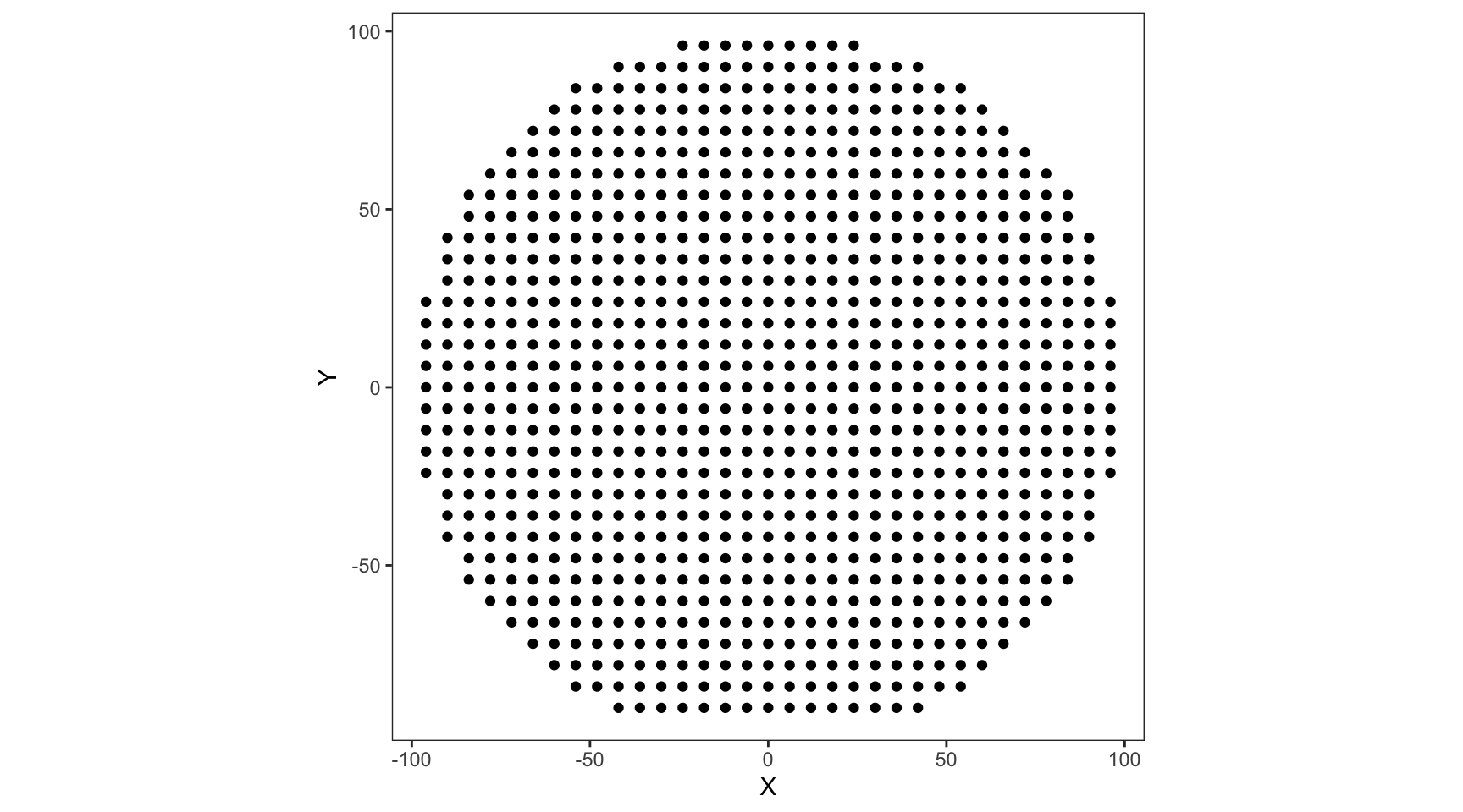
Function to generate mock test-data (click on the Code button below)
generate_wafer_data <-
  function(df_waferXY,
           LotID = 'tmp',
           Wafers = c(1),
           rMean = 80,
           radialFactor = 0.3,
           rSD = 5,
           vMean = 0.75,
           vSD = 0.05,
           ioffMean = -8) {
    df <- df_wafer_XY[rep(seq_len(nrow(df_wafer_XY)), length(Wafers)),]
    df['LotID'] <- LotID
    df['Wafer'] <- rep(Wafers, each = nrow(df_waferXY))

    # Generate normally distributed data with additional component increasing with radius
    df['T01_RES'] <- ((rnorm(nrow(df), rMean, rSD) *
                         (1 + radialFactor * (df['radius'] / max(
                           df['radius']
                         )) ** 2)) +
                        ((rnorm(nrow(
                          df
                        ), 0, rSD / 5) ** 2) *
                          (1 + radialFactor * (df['radius'] / max(
                            df['radius']
                          ))) ** 6))

    # Hardcoding extreme outliers to simulate machine error codes etc.
    df[df['T01_RES'] > 120, 'T01_RES'] <- 10000

    # Generate normally distributed data with additional component increasing with radius
    df['T02_VTH'] <- ((rnorm(nrow(df), vMean, vSD) *
                         (1 + radialFactor * (df['radius'] / max(
                           df['radius']
                         )) ** 2)))

    # The leakages generally tend to vary in orders of magnitude. So, they are simulated as 10^X,
    # where X is a normally distributed random variable

    df['T03_IOFF'] <- 10 ** rnorm(nrow(df), ioffMean, 0.5)
    df['T04_IG_3V'] <- 10 ** rnorm(nrow(df),-6, 0.4)
    df['T05_IG_4V'] <- 10 ** rnorm(nrow(df),-5, 0.4)
    df['T06_IG_5V'] <- 10 ** rnorm(nrow(df),-4, 0.4)

    # "Pass" column corresponds to die passing all the tests, based on the limits above.
    df['Pass'] <- ((df['T01_RES'] < 100) &
                     (df['T02_VTH'] > 0.6) & (df['T02_VTH'] < 1.2) &
                     (df['T03_IOFF'] < 1e-7) &
                     (df['T04_IG_3V'] < 5e-4) &
                     (df['T05_IG_4V'] < 5e-4) &
                     (df['T06_IG_5V'] < 5e-4))
    return(df)

  }

# Generate the initial data to be analyzed
df_baseline <-
  generate_wafer_data(
    df_wafer_XY,
    LotID = 'Old_1',
    Wafers = (1:6),
    radialFactor = 0.3,
    ioffMean = -7.5
  )
Data Exploration for understanding the cause of low yield
We are told that our current baseline process is yielding low and are tasked with improving the yield. The test data from latest lot (data frame generated in python above), and the test limits (as listed in the table above) are provided. As the technology development team members, we are supposed to come up with ideas and improve the process.
Since we will be doing all the visualizations in R, let us first copy the dataframe generated in Python into the R environment for easier access. Also display the first few rows of the data as a sample.
# Display the first few rows as a sample
df_baseline %>%
  select(-any_of(
  c("LotID", "radius"))) %>%
  head() %>%
  mutate_if(is.numeric, funs(as.character(signif(., 3)))) %>%
  kable() %>%
  kable_styling(
    bootstrap_options = "striped",
    full_width = F,
    position = "center"
)| X | Y | Wafer | T01_RES | T02_VTH | T03_IOFF | T04_IG_3V | T05_IG_4V | T06_IG_5V | Pass |
|---|---|---|---|---|---|---|---|---|---|
| -42 | -90 | 1 | 114 | 1.09 | 3.6e-09 | 8.04e-07 | 0.000104 | 0.00013 | FALSE |
| -36 | -90 | 1 | 97.6 | 0.959 | 4.87e-08 | 4.02e-07 | 3.7e-06 | 3.98e-05 | TRUE |
| -30 | -90 | 1 | 106 | 0.889 | 1.47e-07 | 1.2e-06 | 8.88e-06 | 0.000116 | FALSE |
| -24 | -90 | 1 | 102 | 0.966 | 1.21e-08 | 3.25e-07 | 4.01e-06 | 0.000237 | FALSE |
| -18 | -90 | 1 | 108 | 1.01 | 8.36e-08 | 1.24e-06 | 6.51e-06 | 4.21e-05 | FALSE |
| -12 | -90 | 1 | 119 | 0.886 | 1.65e-07 | 1.82e-06 | 2.11e-06 | 0.000111 | FALSE |
Let us now check the yields of each wafer as indicated by the ‘Pass’ column value for each die:
# Code below calculates the yield by wafer and plots a bar chart.
# Yield by wafer is calculate by looking at the fraction of dies with "Pass" == TRUE in a wafer

df_baseline %>%
  group_by(Wafer) %>%
  summarise(Yield_Percentage = sum(Pass)/n()) %>%
  ggplot(aes(x = Wafer, y = Yield_Percentage)) +
  geom_bar(stat = "identity", fill = 'gray50', width = 0.7) +
  scale_y_continuous(labels = function(x){scales::percent(x, accuracy = 1)}, expand = expansion(add = c(0,0.05))) +
  scale_x_continuous(breaks = (1:6), expand = expansion(0,0)) +
  geom_text(aes(label = scales::percent(Yield_Percentage, accuracy = 1)),
              nudge_y = 0.02, color = 'gray50') +
  labs(y = 'Yield (% of Passing Die)', x = 'Wafer Number', title = 'Yield by Wafer') +
  theme_minimal() +
  theme(axis.text.x = element_text(size = 14, color = 'gray40'),
        axis.text.y = element_blank(),
        axis.title.x = element_text(size = 16, color = 'gray40'),
        axis.title.y = element_blank(),
        plot.title = element_text(size = 16, color = 'gray40', hjust = 0.5),
        panel.grid = element_blank())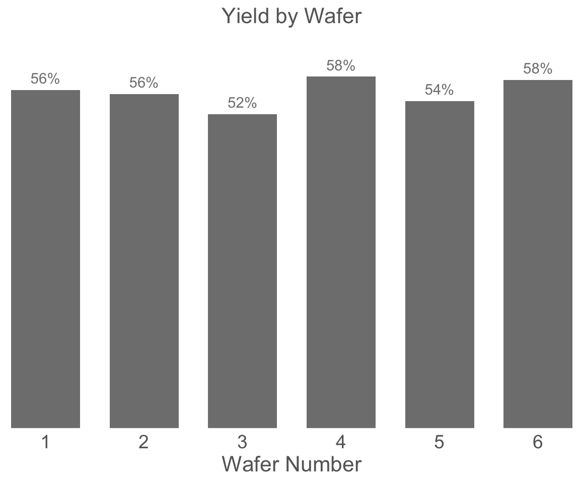
The next step is to figure out which tests are contributing to the yield loss using the limits provided before. Let us look at what percentage of dies are passing each test in each wafer. It is always good to look at the yields by wafer along with yields for all the wafers together as there could be some wafer to wafer variations in the manufacturing.
# The test names are assigned as the row names for convenience
row.names(df_limits) <- df_limits$TestName

# The function below generates a tile plot of yield by category for each wafer
# taking the test data and test limits as inputs

plot_yield_tile <- function(df_limts, df_test_data) {
  # Generate a separate Pass/Fail column for each test
  for (i in 1:nrow(df_limits)) {
    df_test_data[paste0('Pass_', df_limits$TestName[i])] <- ((
      is.na(df_limits$UpperLimit[i]) |
        (df_test_data[paste0(df_limits$TestName[i])] < df_limits$UpperLimit[i])
    )  &
      (
        is.na(df_limits$LowerLimit[i]) |
          (df_test_data[paste0(df_limits$TestName[i])] > df_limits$LowerLimit[i])
      ))
  }

  # Calculate yield grouped by category and wafer
  df_category_yield <- df_test_data[c('LotID', 'Wafer',
                                      grep('Pass', colnames(df_test_data), value = T))] %>%
    melt(id.vars = c('LotID', 'Wafer'),
         variable.name = 'Category') %>%
    group_by(LotID, Wafer, Category) %>%
    summarise(Yield_Percent = sum(value) / n(), NumDies = n(), .groups = 'drop_last')

  # Cleaning up the category names
  df_category_yield$Category <-
    gsub('Pass$', 'Final_Yield', df_category_yield$Category)

  # Generating the tile plot
  pyield <-
    ggplot(df_category_yield,
           aes(x = Wafer, y = Category, fill = Yield_Percent)) +
    geom_tile(color = 'black') +
    geom_text(aes(label = scales::percent(Yield_Percent, accuracy = 1)), size = 5) +
    scale_fill_distiller(palette = 'Blues', trans = "reverse", labels = scales::percent) +
    scale_x_continuous(expand = expansion(0, 0), breaks = (1:6)) +
    scale_y_discrete(expand = expansion(0,0)) +
    theme(axis.text = element_text(size = 12),
          axis.title.x = element_text(size = 16),
          axis.title.y = element_blank(),
          legend.position = 'none',
          ) +
    labs(title = 'Percentage of dies passing each test in each wafer')

  return(pyield)
}

print(plot_yield_tile(df_limts, df_baseline))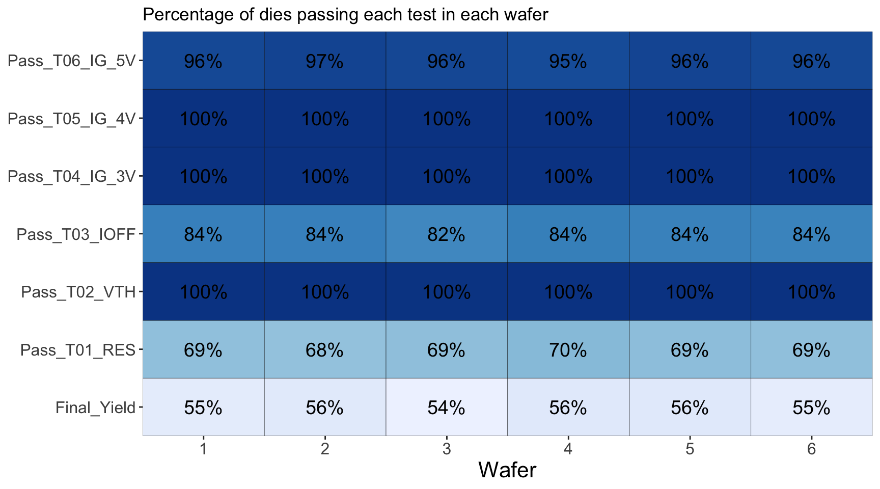
From the above, we can conclude the following:
- The tests causing major yield loss are T01_RES and T03_IOFF. Other tests have nearly 100% of the die passing the tests
- There is no significant wafer to wafer variation in the yield loss
- Over all yield is running at about 55 to 60% as observed before
Another way to look at yield losses is to look at a yield pareto, which would list the yield loss categories from most frequent to least frequent. Since we already know that there is no significant wafer to wafer variation, we will look at yield loss for the whole lot to give us a bigger picture.
# The function below genrates a yield pareto chart which displays yield loss categories
# from most significant to least significant as a bar chart

plot_yield_pareto <- function(df_limts, df_test_data){

  # Generate a separate Pass/Fail column for each test
  for(i in 1:nrow(df_limits)){
    df_test_data[paste0('Pass_',df_limits$TestName[i])] <- (
      (is.na(df_limits$UpperLimit[i]) |
         (df_test_data[paste0(df_limits$TestName[i])] < df_limits$UpperLimit[i]))  &
      (is.na(df_limits$LowerLimit[i]) |
         (df_test_data[paste0(df_limits$TestName[i])] > df_limits$LowerLimit[i]))
      )
  }

  # For the pareto we need to identify the first test which fails for each die
  # If none of the tests fail, the die is marked as "Pass"
  df_tests_inverse <- !(df_test_data[grep('Pass_T',colnames(df_test_data), value = T)])
  df_test_data$FirstFailTest <- colnames(df_tests_inverse)[ifelse(
                              rowSums(df_tests_inverse)==0, NA,max.col(df_tests_inverse, "first"))]
  df_test_data$FirstFailTest <- ifelse(is.na(df_test_data$FirstFailTest),
                                       'Pass',gsub('Pass_','',df_test_data$FirstFailTest))

  # Generate the plot
  pareto <- df_test_data %>% group_by(FirstFailTest) %>%
              summarise(Bin_Perc = n()/nrow(df_test_data)) %>%
              ggplot(aes(x = reorder(FirstFailTest,-Bin_Perc),
                         y = Bin_Perc)) +
              #, fill = FirstFailTest
              geom_bar(stat = 'identity', fill = 'gray50', width = 0.7) +
              geom_text(aes(label = scales::percent(Bin_Perc, accuracy = 1)), nudge_y = 0.02, color = 'gray50') +
              scale_fill_brewer(type = 'qual') +
              labs(fill = '', x = 'First Failed Test or Pass',
                   y = 'Bin Percentage', title = 'Failure Bin Category by First Failed Test') +
              scale_y_continuous(expand = expansion(add = c(0, 0.05)), labels = scales::percent) +
              scale_x_discrete(expand = expansion(0,0)) +
              theme_minimal() +
              theme(axis.text = element_text(size = 12),
                    panel.grid = element_blank(),
                    axis.title.x = element_text(size = 16, color = 'gray40'),
                    axis.text.y = element_blank(),
                    axis.title.y = element_blank(),
                    legend.position = 'none',
                    )

  return(pareto)
}
plot_yield_pareto(df_limts, df_baseline)
So far, we have figured out T01_RES, and T03_IOFF were our biggest yield loss factors, but we have not yet looked at the individual measurement data. In the following section, we look at each individual test and how it is distributed around the wafer, for T01 to T06.
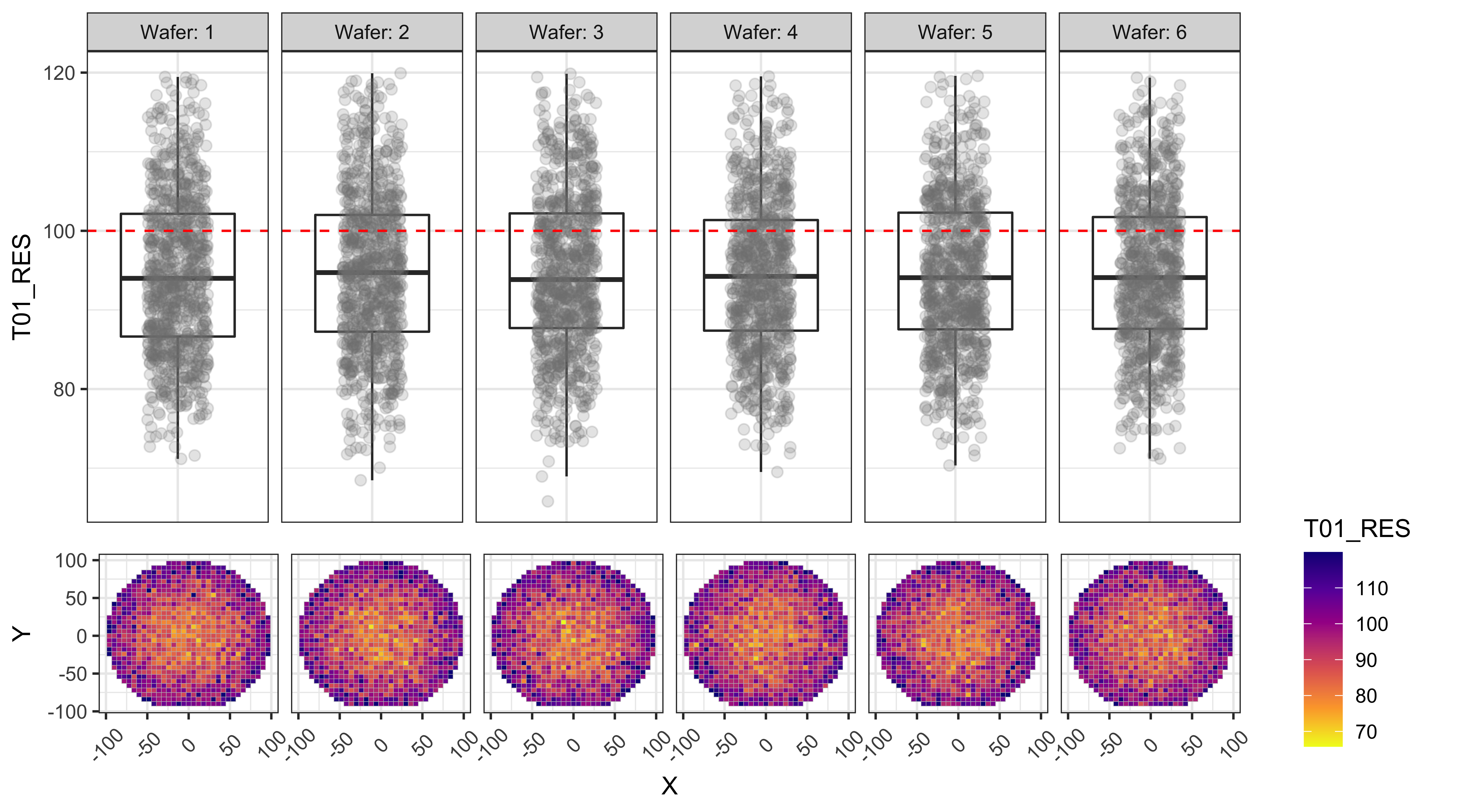
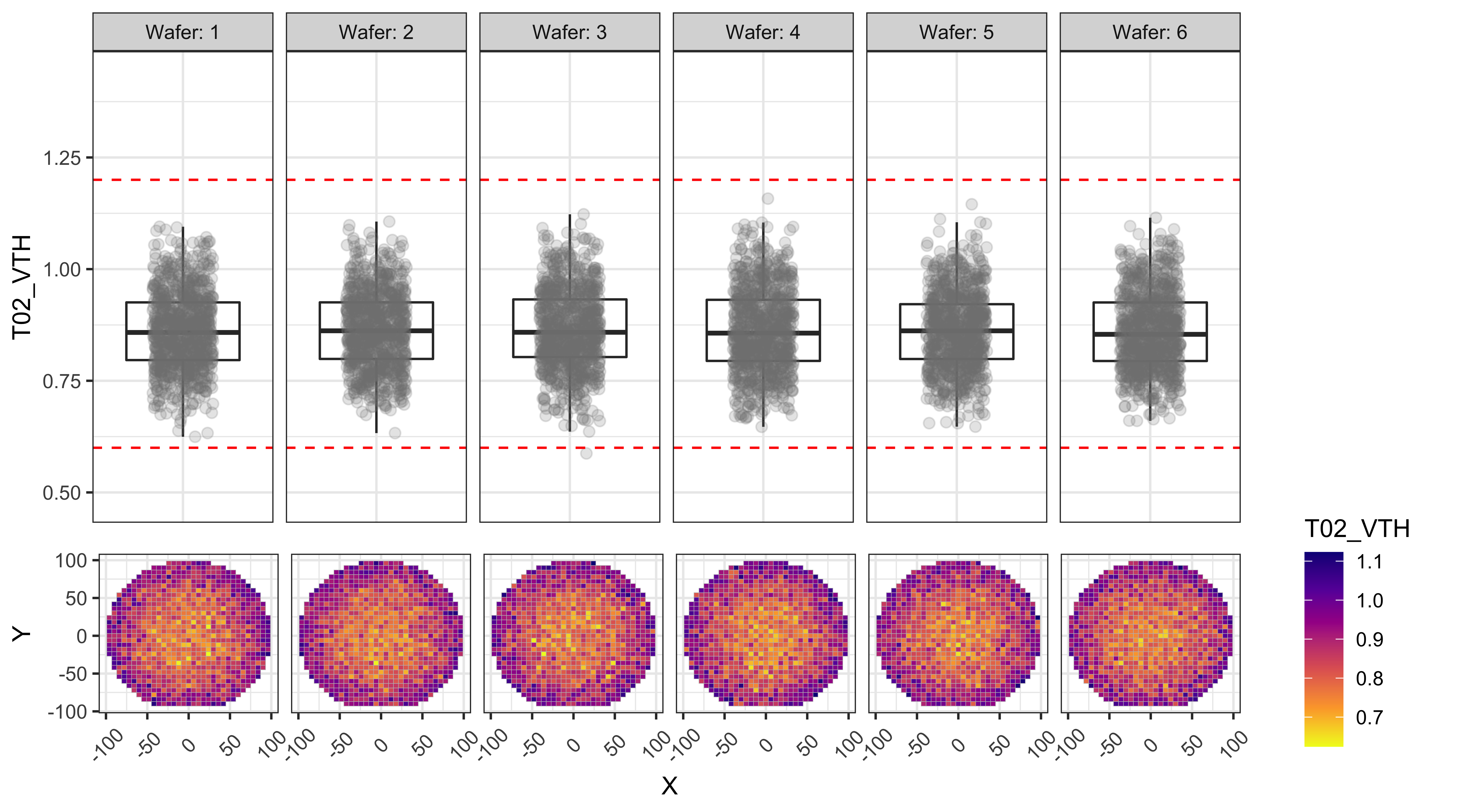
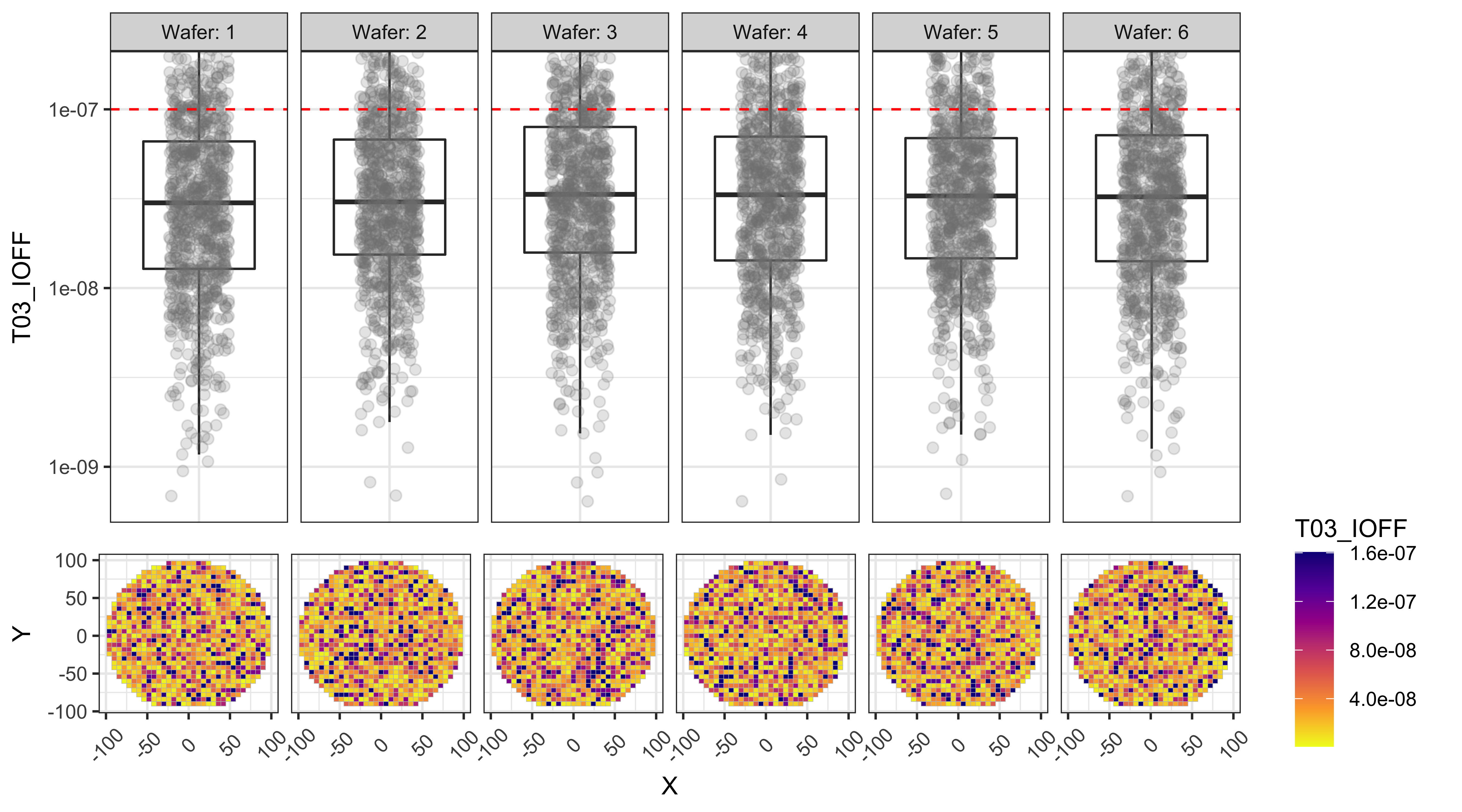
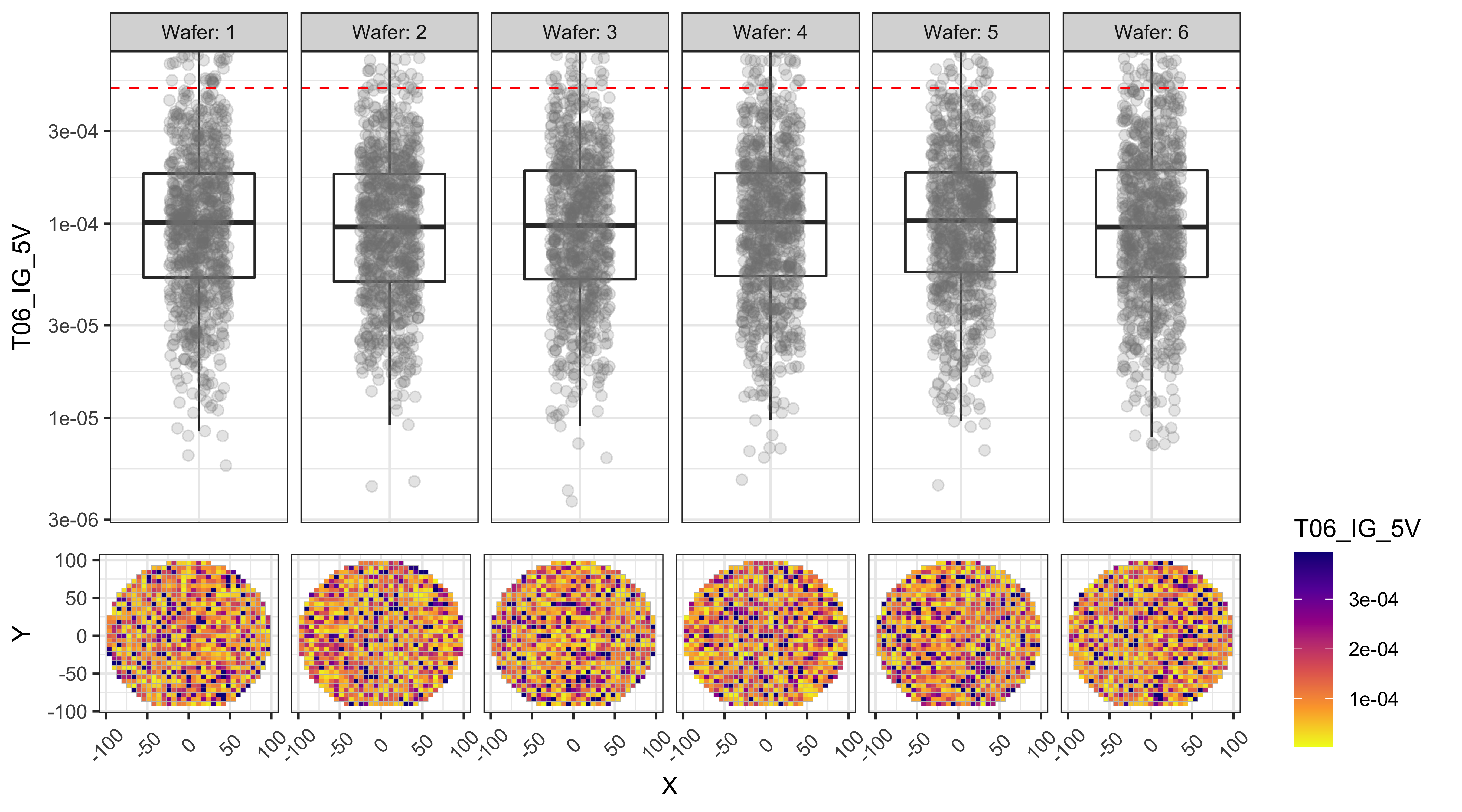
Test data Box-plots and Wafer Maps
The following plots show box-plots for each wafer and each test, along with the wafers maps showing how the data is distributed around the wafer. The upper and lower limits for each test (if applicable), are also shown as the red-dashed-lines.
From the figures below we can observe that:
- T01 and T02 show a center to edge increase in the results.
- T01 has a large number of points above the test limit, which is causing this test to be the major yield loss factor.
- The dies with high T01 values are near the edges, while the dies with high T03 values are more randomly distributed.
# changing the wafer variable from numeric to factor for better formatting
df_baseline$Wafer <- as.factor(df_baseline$Wafer)

# loop through the test data columns and generate one plot for each test
for (col in grep('T0', colnames(df_baseline), value = T)) {
  # automatically determine the limits to be used for Y-axis
  # this is to exclude outliers and zoom to a sensible window
  ylim1 <-
    boxplot.stats(df_baseline[, col], coef = 1.6)$stats[c(1, 5)]
  ybox_min <-
    min(ylim1[1], df_limits[col, 'LowerLimit'] * 0.8, na.rm = T)
  ybox_max <-
    max(ylim1[2], df_limits[col, 'UpperLimit'] * 1.2, na.rm = T)

  pbox <- ggplot(df_baseline, aes_string(y = col, x = 'Wafer')) +
    geom_boxplot(outlier.alpha = 0) +
    geom_jitter(
      aes(color = 'gray'),
      alpha = 0.2,
      size = 2,
      width = 0.2,
      show.legend = FALSE
    ) +
    facet_grid( ~ Wafer, scales = 'free_x', labeller = label_both) +

    # apply the automatic Y-axis limits from above
    coord_cartesian(ylim = c(ybox_min, ybox_max)) +

    # add lines corresponding to the upper and lower test limits
    geom_hline(yintercept = df_limits[col, 'LowerLimit'],
               color = 'red',
               linetype = 2) +
    geom_hline(yintercept = df_limits[col, 'UpperLimit'],
               color = 'red',
               linetype = 2) +

    # theme changes for better formatting
    theme_bw() +
    theme(
      axis.text.x = element_blank(),
      axis.title.x = element_blank(),
      axis.ticks.x = element_blank()
    ) +
    scale_color_manual(values = c('gray50'))


  # currents are better displayed in log-scale on the Y-axis
  if (grepl('_I', col)) {
    pbox <- pbox + scale_y_log10()
  }

  pmap <- ggplot(df_baseline, aes(x = X, y = Y)) +
    geom_tile(color = 'gray', aes_string(fill = col)) +
    facet_grid( ~ Wafer, scales = 'free_x', labeller = label_both) +
    scale_fill_viridis_c(option = 'plasma',
                         limits = ylim1,
                         oob = squish,
                         direction = -1
                         ) +
    theme_bw() +
    theme(strip.text = element_blank(),
          axis.text.x = element_text(angle = 45, vjust = 0.5))

  p_legend <-
    ggarrange(
      get_legend(pmap),
      ggplot() + theme_void(),
      nrow = 2,
      heights = c(2, 1)
    )
  pmap <- pmap + theme(legend.position = 'none')


  # Print one header per graph (useful when automating reports)
  cat('###  ', col, '\n\n')
  print(
    ggarrange(
      pbox,
      ggplot() + theme_void(),
      pmap,
      p_legend,
      ncol = 2,
      nrow = 2,
      heights = c(2, 1),
      widths = c(6, 1),
      align = 'v'
    )
  )
  cat(' \n\n')
}
T01_RES
T02_VTH
T03_IOFF
T04_IG_3V
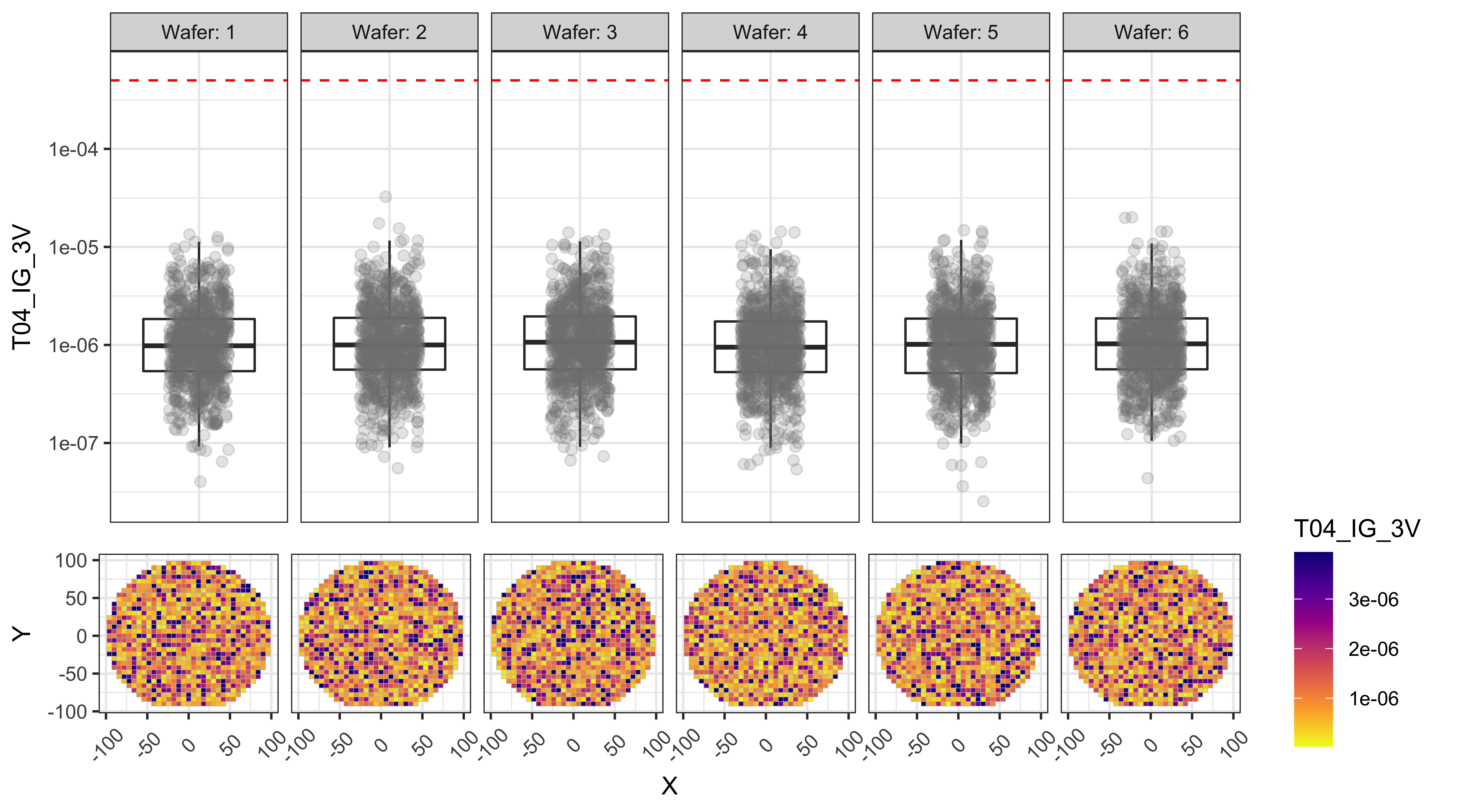
T05_IG_4V
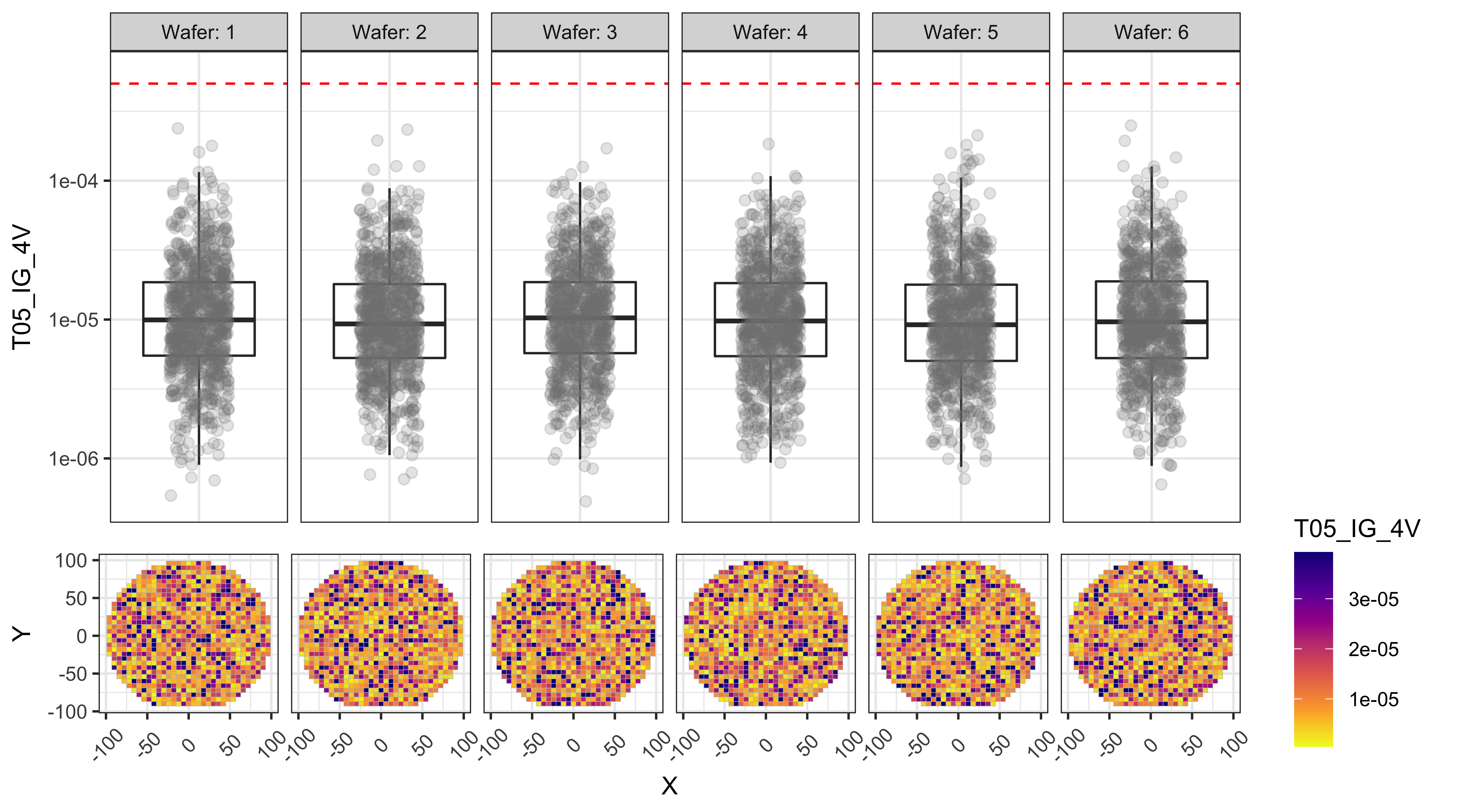
T06_IG_5V
Experiment design for yield improvement and mock-data generation
Let us assume that the team came up with two ideas to improve the yield:
- Reduce the center to edge non-uniformity by changing the temperature
- Reduce the T01_RES values by changing the strain of a certain film, which may have some other effects
Ideally we would do a full-factorial experiment design to ensure we will have enough Power to draw useful conclusions from the experiment. But for simplicity, let us assume we tried two additional levels of temperature and one additional level of strain in our experiment.
The following code generates the new data frame with the intended properties using the “generate_wafer_data” function we wrote before.
# Generate different types of data for each process separately
df_baseline_POR <- generate_wafer_data(df_wafer_XY, LotID = 'Exp_1',
                  Wafers = c(1,5,9), radialFactor = 0.3, ioffMean = -7.5)
df_process_A1 <- generate_wafer_data(df_wafer_XY, LotID = 'Exp_1',
                  Wafers = c(2,6,10), rMean = 80, radialFactor = 0.1, ioffMean = -7.5)
df_process_A2 <- generate_wafer_data(df_wafer_XY, LotID = 'Exp_1',
                  Wafers = c(3,7,11), rMean = 65, radialFactor = 0.8, ioffMean = -7.5)
df_process_B1 <- generate_wafer_data(df_wafer_XY, LotID = 'Exp_1',
                  Wafers = c(4,8,12), rMean = 65, vMean = 0.65, radialFactor = 0.3, ioffMean = -7)

# Assign the process parameters for each process split
df_baseline_POR <- df_baseline_POR %>%
  mutate( Process = 'Baseline', Temp = 'Baseline', Strain = 'Baseline')
df_process_A1 <- df_process_A1 %>%
  mutate( Process = 'A1', Temp = 'Higher', Strain = 'Baseline')
df_process_A2 <- df_process_A2 %>%
  mutate( Process = 'A2', Temp = 'Lower', Strain = 'Baseline')
df_process_B1 <- df_process_B1 %>%
  mutate( Process = 'B1', Temp = 'Baseline', Strain = 'Higher')

# Combine the data into one data frame with 12 wafers
df_experiment <- bind_rows(df_baseline_POR, df_process_A1, df_process_A2, df_process_B1)
Here is a table of split conditions for various wafers in our experiment
kable(df_experiment %>% group_by(Wafer,Process,Temp,Strain) %>% summarise(.groups = 'rowwise')) %>%
kable_styling(bootstrap_options = "striped", full_width = F, position = "center")| Wafer | Process | Temp | Strain |
|---|---|---|---|
| 1 | Baseline | Baseline | Baseline |
| 2 | A1 | Higher | Baseline |
| 3 | A2 | Lower | Baseline |
| 4 | B1 | Baseline | Higher |
| 5 | Baseline | Baseline | Baseline |
| 6 | A1 | Higher | Baseline |
| 7 | A2 | Lower | Baseline |
| 8 | B1 | Baseline | Higher |
| 9 | Baseline | Baseline | Baseline |
| 10 | A1 | Higher | Baseline |
| 11 | A2 | Lower | Baseline |
| 12 | B1 | Baseline | Higher |
Visualization improvements for analyzing data from multiple processes
As we can see, our lot now consists of wafers from 4 different processes, and more efforts are needed to visualize the data effectively.
For example, if we were to look at the test results “T01_RES” without much customization, it is pretty hard to understand which process conditions are better, even though we already took care of basic things like excluding the outliers etc.
Bad visualization of the data with a default box plot:
# Box plot with minimal customization
# Outliers are excluded using a manual zoom on the Y-axis
pbox <- ggplot(df_experiment, aes_string(y = 'T01_RES', x = 'Wafer')) +
          geom_boxplot(outlier.alpha = 0) +
          geom_jitter(alpha = 0.2, size = 2, width = 0.2) +
          facet_grid(~Wafer+Temp+Strain+Process, labeller = label_both, scales = 'free_x') +
          coord_cartesian(ylim = c(60,150))
print(pbox)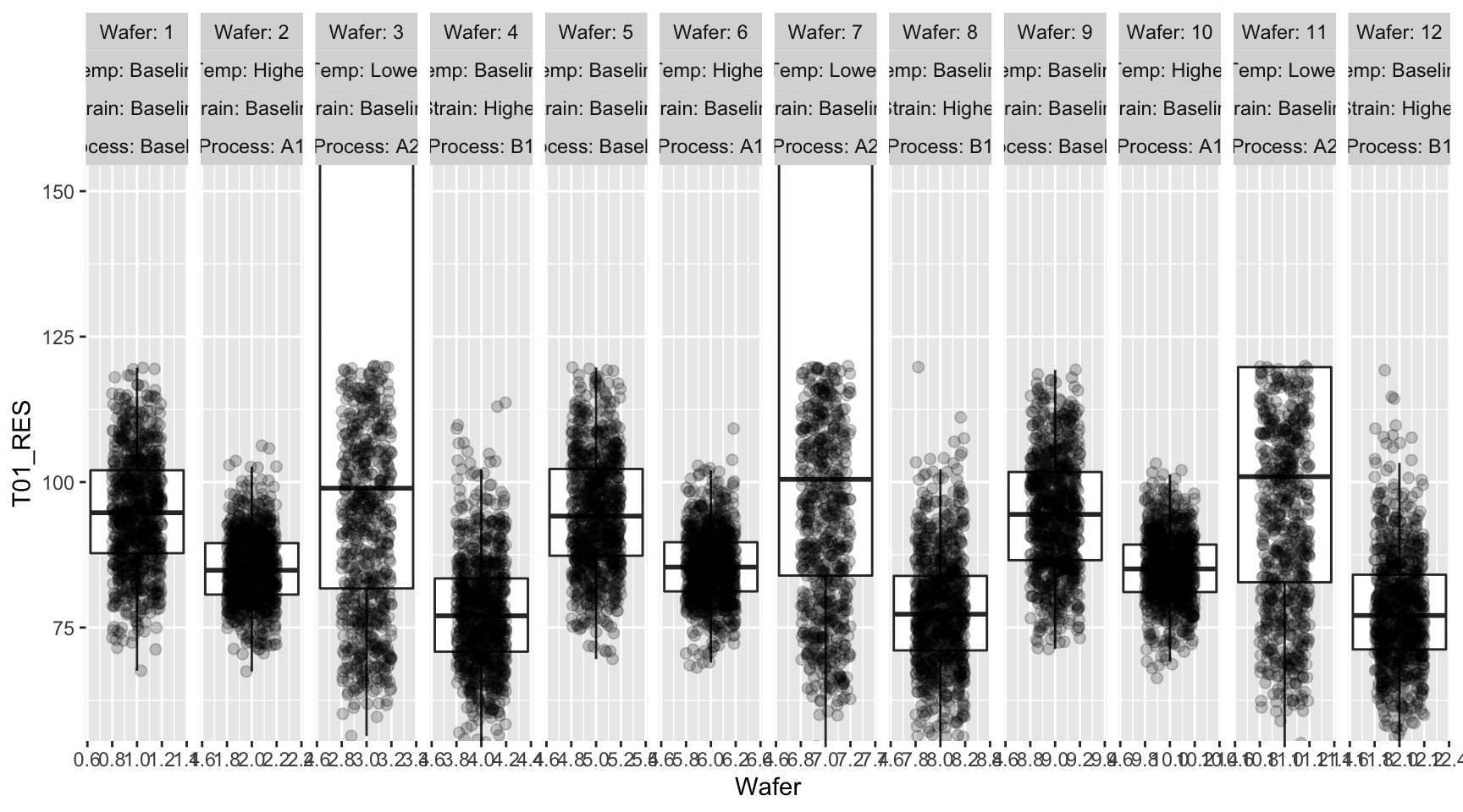
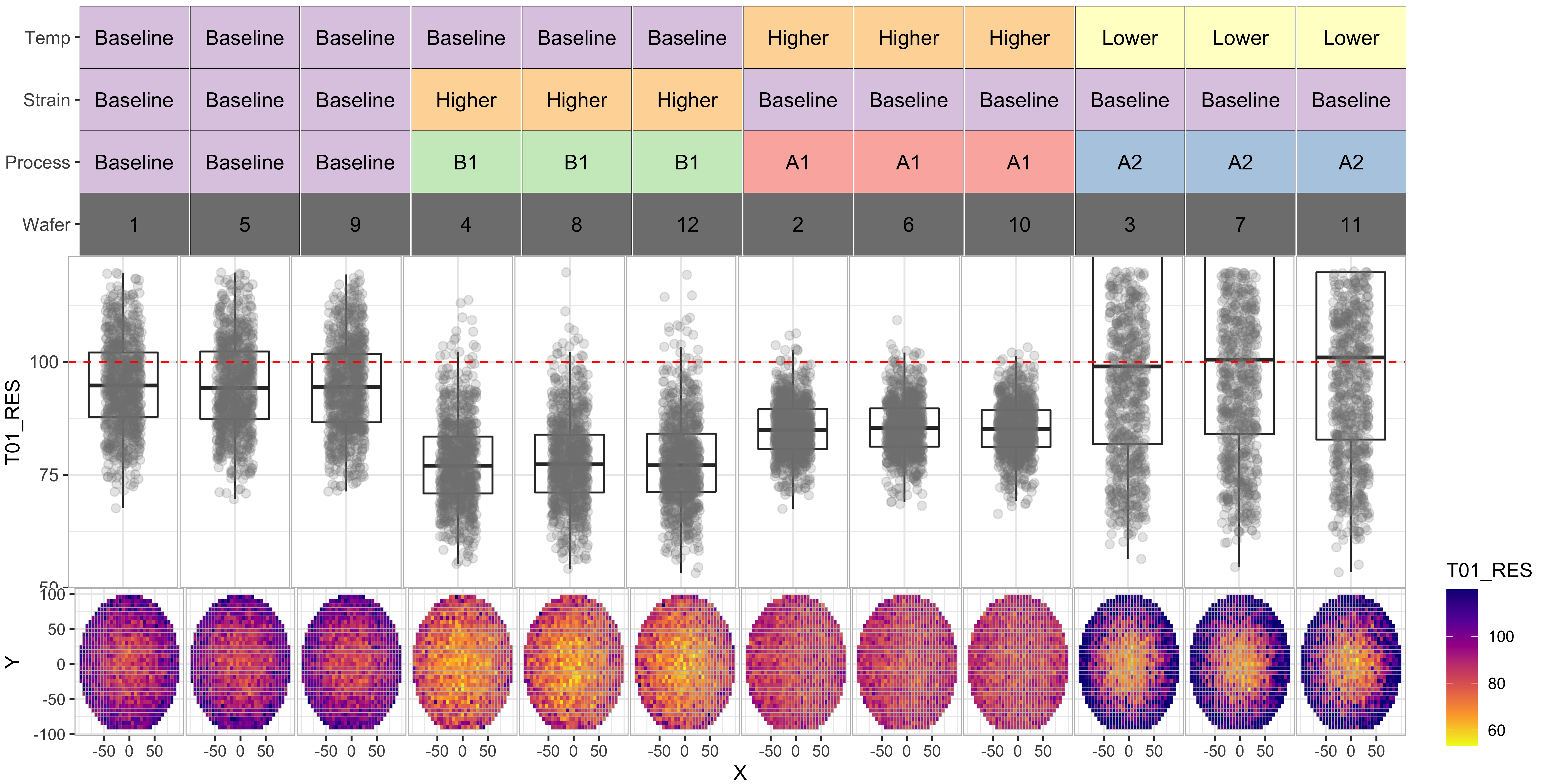
To help visualize the data better for this experiment with multiple variables, I did the following customization to result in more informative visualizations: (some of these features were already implemented in the previous set of box plots).
- Replace the upper “Facet” ribbon with a color-coded grid of factor values for each variable, so that we can tell which process splits are similar and which are not
- Automatically calculate the appropriate Y-range for each variable by using “box plot.stats” function, and also look at the test upper and lower limits
- Add wafer map below each box plot so that we can compare any systematic differences between processes
- Apply log-scale for the currents T04 through T06, as they are expected to vary in orders of magnitude
# Change Wafer column to factor type for better formatting
df_experiment$Wafer <- as.factor(df_experiment$Wafer)

# The columns to be used for grouping / faceting
# This can be customized based on experiment conditions
grouping_cols <- c('Temp', 'Strain', 'Process', 'Wafer')
facet_formula = as.formula(paste("~", paste0(grouping_cols, collapse = '+')))

# Code below generates a tile plot with experiment variables on Y-axis
# and various levels of those variables color coded
# this tile plot replaces the ribbon / strip associated with the facet information

group_table <-
  df_experiment %>% group_by(.dots = grouping_cols) %>% summarise(.groups = 'rowwise')
group_table2 <- group_table
colnames(group_table2) <- paste0(colnames(group_table2), '_tmp1')
group_table <- cbind(group_table, group_table2)
group_table_stack <-
  melt(group_table, id.vars = grouping_cols, variable.name = 'Split')
group_table_stack$Split <-
  factor(gsub('_tmp1$', '', group_table_stack$Split),
         levels = rev(grouping_cols))
group_table_stack$value2 <- group_table_stack$value
group_table_stack$value2[group_table_stack$Split == 'Wafer'] <- NA
p_strip <-
  ggplot(group_table_stack, aes(x = Wafer, y = Split, label = value)) +
  geom_tile(aes(fill = value2), color = 'black') +
  geom_text(size = 4) +
  facet_grid(facet_formula, scales = 'free_x') +
  scale_x_discrete(expand = c(0, 0)) +
  theme(
    legend.key.size = unit(0, 'cm'),
    legend.text = element_text(size = 1, color = 'white'),
    axis.title.x = element_blank(),
    axis.text.x = element_blank(),
    axis.ticks.x = element_blank(),
    axis.title.y = element_blank(),
    axis.text.y = element_text(size = 10, vjust = 0.5),
    strip.text = element_blank(),
    panel.spacing.x = unit(0.05, "lines"),
    panel.background = element_blank(),
    plot.margin = margin(0, 0.1,-0.1, 0.1, "cm"),
    plot.background = element_blank()
  )  +
  labs(fill = '')  +
  scale_fill_manual(values = get_palette('Pastel1', length(unique(
    group_table_stack$value2
  ))))

# Loop through the test data columns and generate one plot for each test
for (col in grep('T0', colnames(df_experiment), value = T)) {
  # Automatically determine the limits to be used for Y-axis
  # This is to exclude outliers and zoom to a sensible window

  ylim1 <-
    boxplot.stats(df_experiment[, col], coef = 1.6)$stats[c(1, 5)]
  ybox_min <-
    min(ylim1[1], df_limits[col, 'LowerLimit'] * 0.8, na.rm = T)
  ybox_max <-
    max(ylim1[2], df_limits[col, 'UpperLimit'] * 1.2, na.rm = T)

  pbox <- ggplot(df_experiment, aes_string(y = col, x = 'Wafer')) +
    geom_boxplot(outlier.alpha = 0) +

    # apply the automatic Y-axis limits from above
    coord_cartesian(ylim = c(ybox_min, ybox_max)) +
    geom_jitter(alpha = 0.2,
                size = 2,
                color = 'gray50',
                width = 0.2) +

    # faceting / grouping based on the chosen categories
    facet_grid(facet_formula, scales = 'free_x') +

    # add lines corresponding to the upper and lower test limits
    geom_hline(yintercept = df_limits[col, 'LowerLimit'],
               color = 'red',
               linetype = 2) +
    geom_hline(yintercept = df_limits[col, 'UpperLimit'],
               color = 'red',
               linetype = 2) +

    # theme settings for better formatting
    theme_bw() +
    theme(
      strip.text = element_blank(),
      axis.text.x = element_blank(),
      axis.title.x = element_blank(),
      axis.text.y = element_text(size = 10),
      panel.spacing.x = unit(0.05, "lines"),
      panel.border = element_rect(
        color = 'gray',
        fill = NA,
        size = 0.5
      ),
      plot.margin = margin(-0.1, 0.1,-0.1, 0.1, 'cm'),
      axis.ticks.x = element_blank()
    )


  # currents are better displayed in log-scale on Y-axis
  if (grepl('_I', col)) {
    pbox <- pbox + scale_y_log10()
  }

  pmap <-
    ggplot(df_experiment, aes(x = X, y = Y)) + geom_tile(color = 'gray', aes_string(fill = col)) +
    facet_grid(facet_formula, scales = 'free_x') +
    scale_fill_viridis_c(
      option = 'plasma',
      limits = ylim1,
      oob = squish,
      direction = -1
    ) +
    scale_x_continuous(breaks = c(-50, 0, 50)) +
    theme_bw() +
    theme(
      strip.text = element_blank(),
      #axis.text.x = element_text(angle = 270, hjust = 0),
      plot.margin = margin(0, 0.1, 0, 0.1, 'cm'),
      panel.spacing.x = unit(0.05, "lines"),
      panel.border = element_rect(
        color = 'gray',
        fill = NA,
        size = 0.5
      )
    )


  p_legend <-
    ggarrange(
      get_legend(pmap),
      ggplot() + theme_void(),
      nrow = 2,
      heights = c(2, 1)
    )

  p_strip <- p_strip + theme(legend.position = 'none')
  pmap <- pmap + theme(legend.position = 'none')


  # print one header per graph (useful when automating reports)
  cat('###  ', col, '\n\n')

  # Use ggrrange to combine multiple sections of the plot
  print(
    ggarrange(
      p_strip,
      ggplot() + theme_void(),
      pbox,
      ggplot() + theme_void(),
      pmap,
      p_legend,
      nrow = 3,
      ncol = 2,
      heights = c(2, 2.5, 1.5),
      widths = c(9, 1),
      align = 'v'
    )
  )

  cat(' \n\n')
}
T01_RES
T02_VTH
T03_IOFF
T04_IG_3V
T05_IG_4V
T06_IG_5V
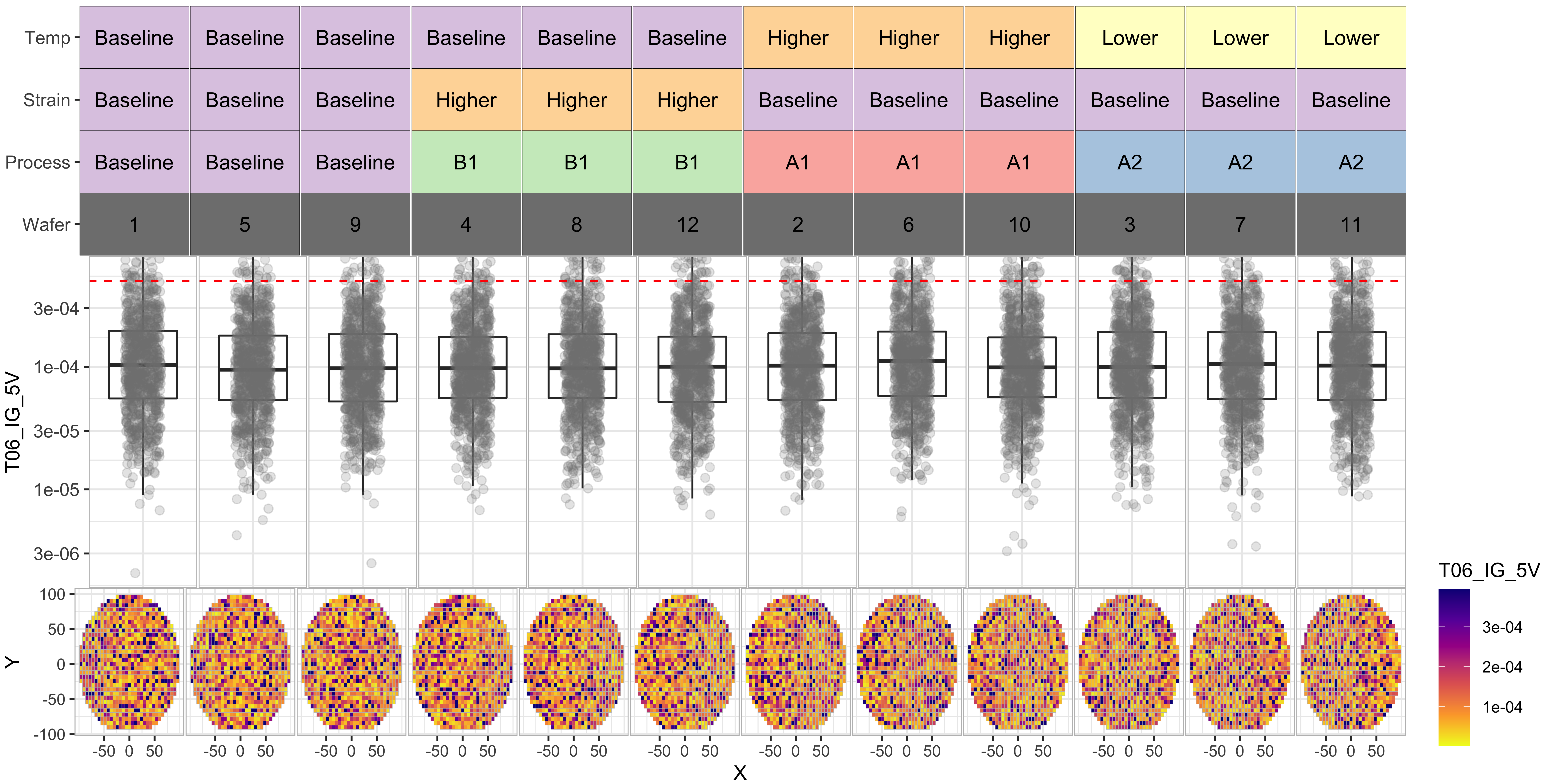
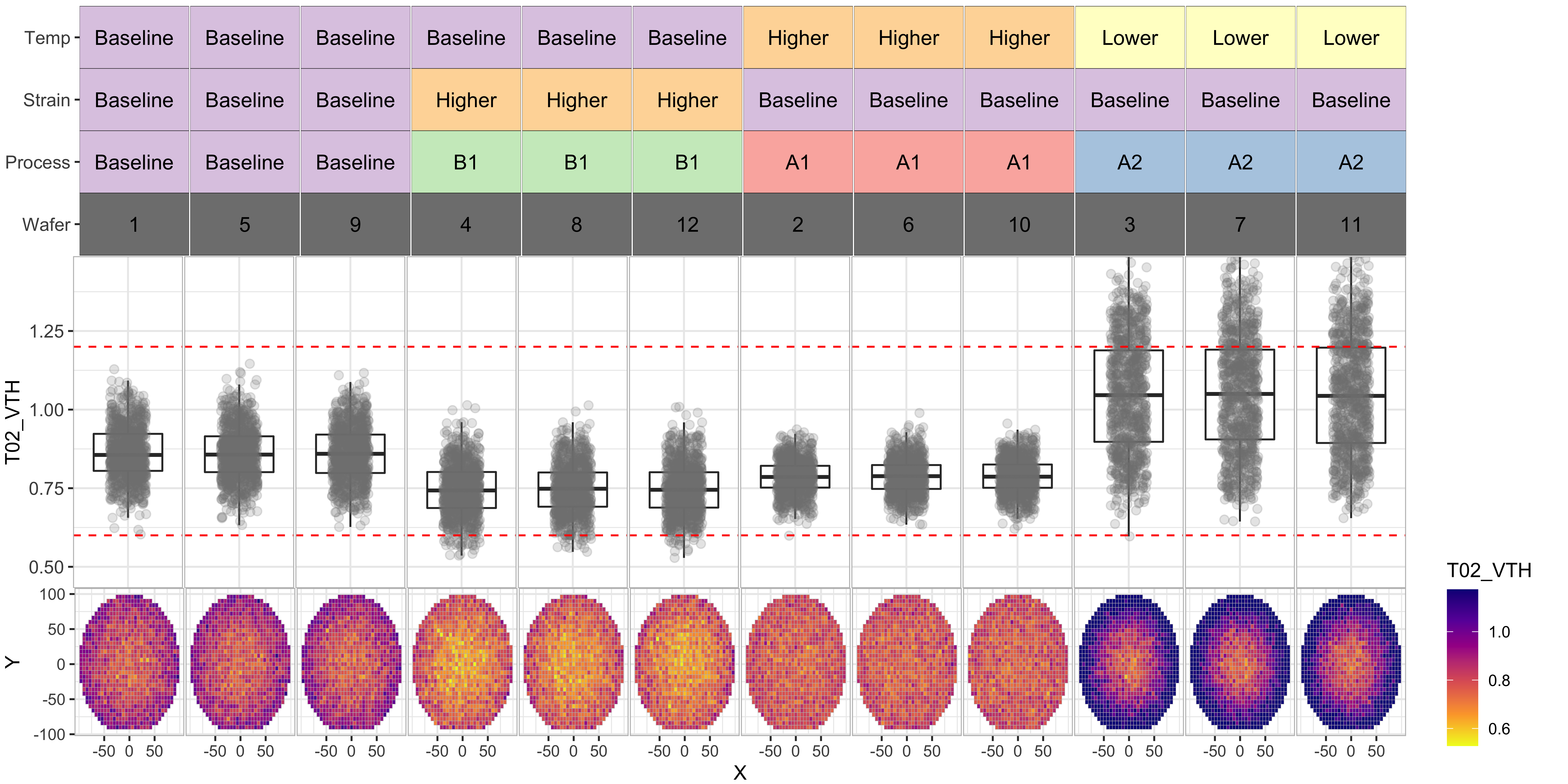
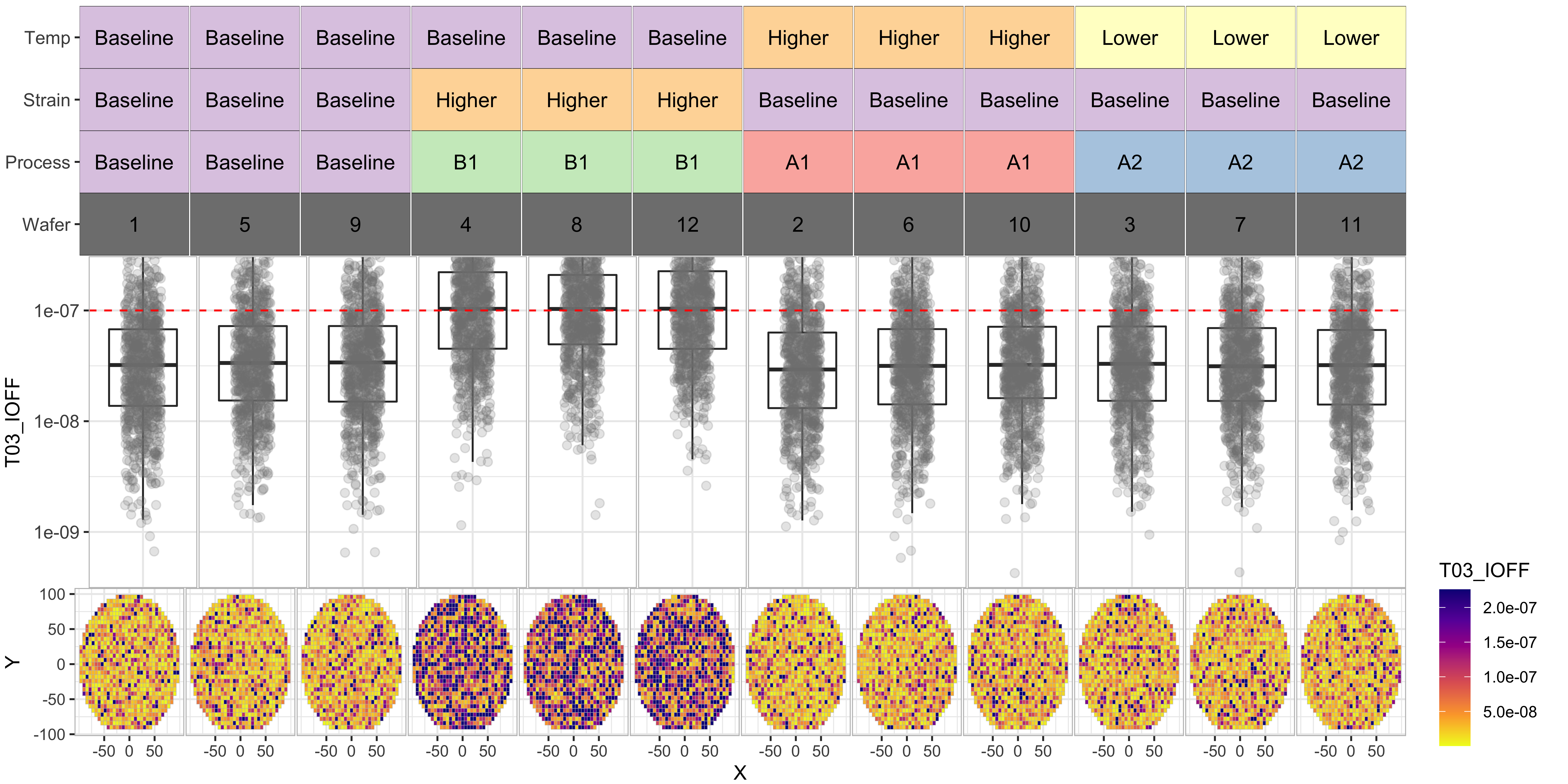
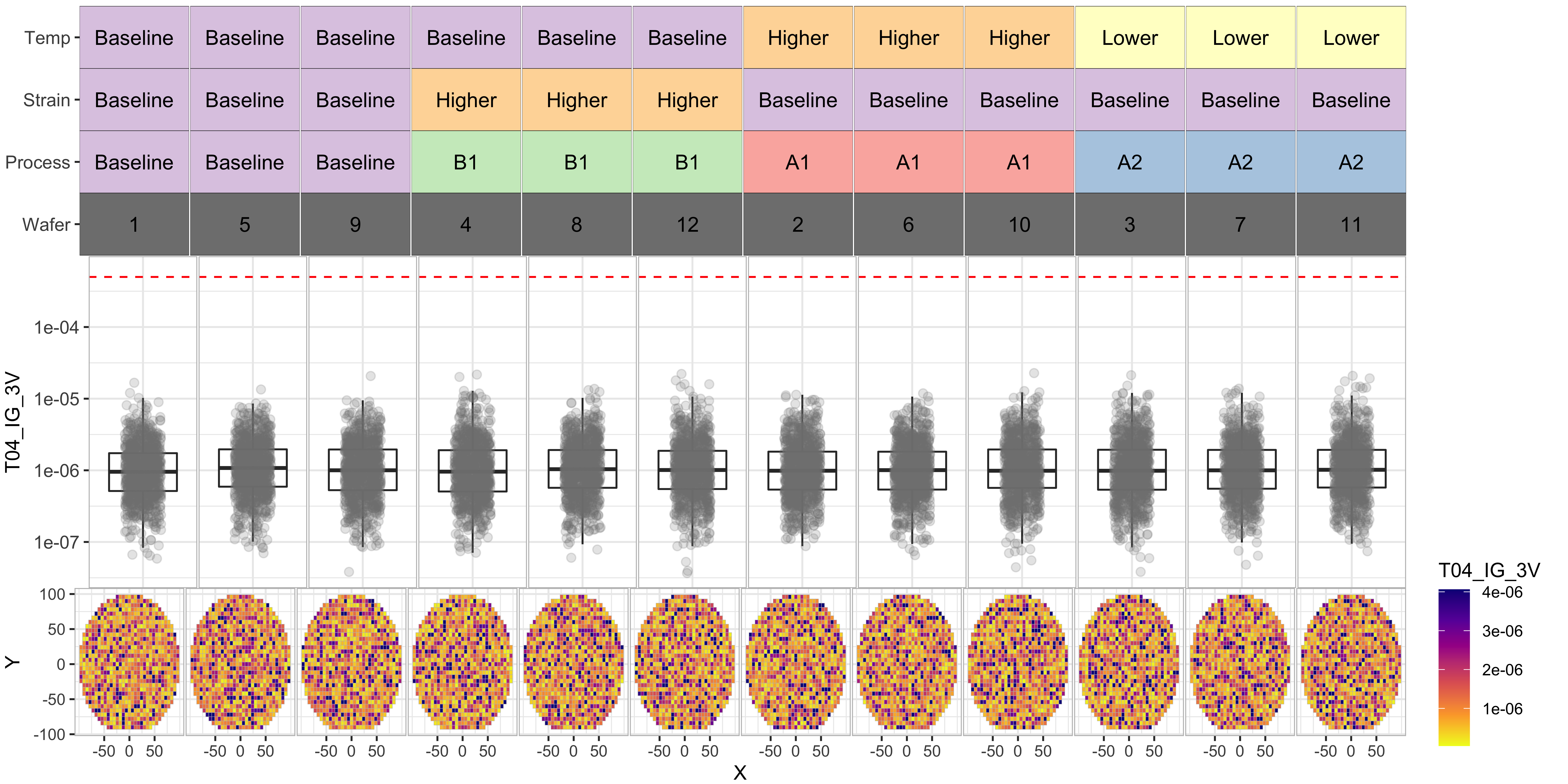
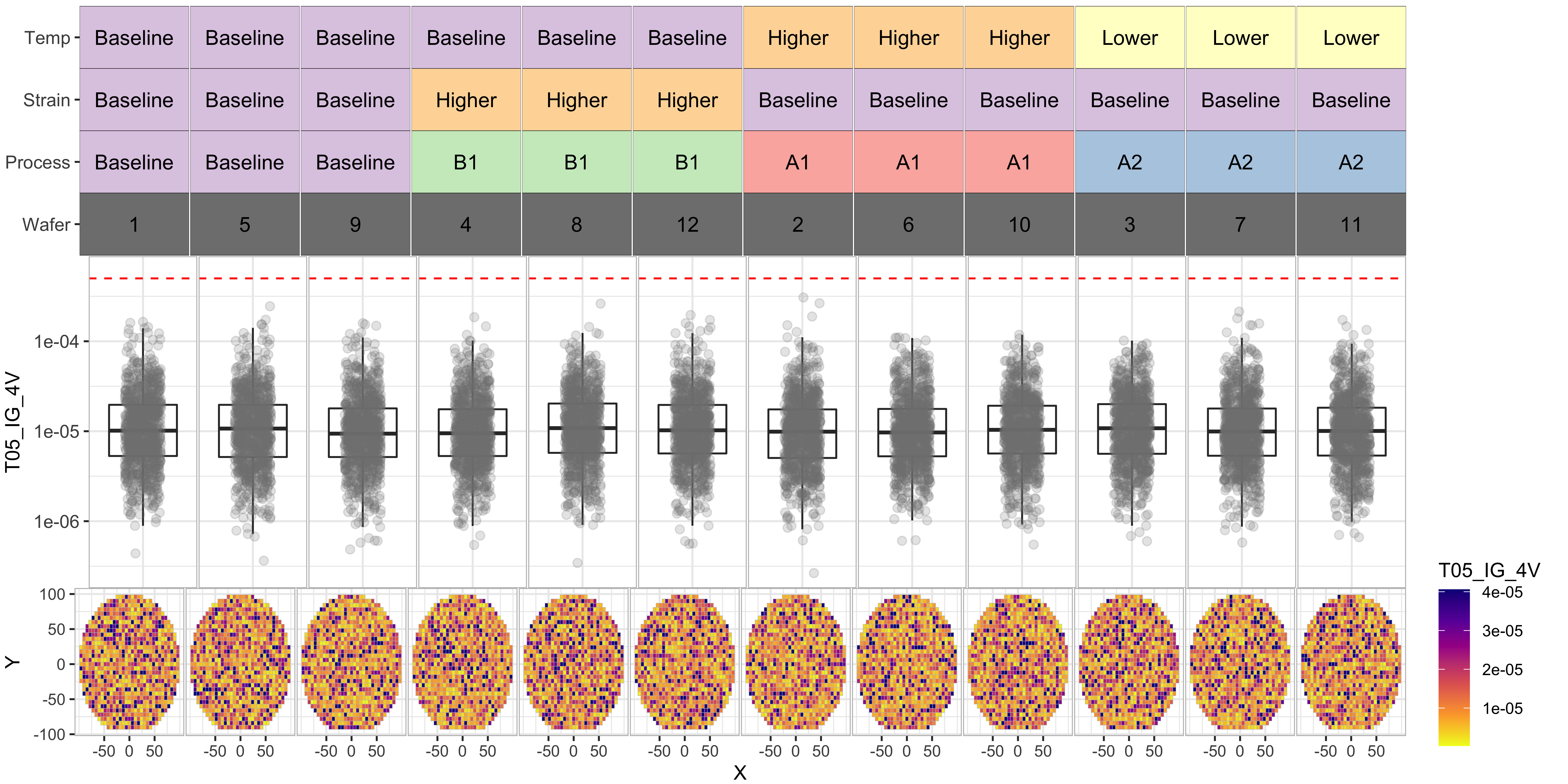
Observations from the experiment
From the above we data, we can see the following:
- Processes “A1” and “B1” have significantly improved the T01_RES distributions
- However process “B1” seems to have degraded the “T03_IOFF” distributions by moving them further beyond the test limit
- Process “A2” seems to have poor results for T02 and T01.
- Overall, process “A1” seems to be our best bet for yield improvement
We can notice the same in the yield by wafer/process tile-plot below, where the last row indicates that the wafers with Process-A1 have the best yields (> 75%)
# The function below generates a tile plot of yield by category for each wafer
# taking the test data and test limits as inputs
plot_yield_tile2 <- function(df_limits, df_test_data) {
  # Generate a separate Pass/Fail column for each test
  for (i in 1:nrow(df_limits)) {
    df_test_data[paste0('Pass_', df_limits$TestName[i])] <- ((
      is.na(df_limits$UpperLimit[i]) |
        (df_test_data[paste0(df_limits$TestName[i])] < df_limits$UpperLimit[i])
    )  &
      (
        is.na(df_limits$LowerLimit[i]) |
          (df_test_data[paste0(df_limits$TestName[i])] > df_limits$LowerLimit[i])
      ))
  }

  # Calculate yield grouped by category and wafer
  df_category_yield <- df_test_data[c(grouping_cols,
                                      grep('Pass', colnames(df_test_data), value = T))] %>%
    melt(id.vars = c(grouping_cols),
         variable.name = 'Category') %>%
    group_by(.dots = c(grouping_cols, 'Category')) %>%
    summarise(
      Yield_Percent = sum(value) / n(),
      NumDies = n(),
      .groups = 'rowwise'
    )

  # Cleaning up the category names
  df_category_yield$Category <-
    gsub('Pass$', 'Final_Yield', df_category_yield$Category)

  # Generating the tile plot
  pyield <-
    ggplot(df_category_yield,
           aes(x = Wafer, y = Category, fill = Yield_Percent)) +
    geom_tile(color = 'black') +
    facet_grid(facet_formula, scales = 'free_x') +
    geom_text(aes(label = scales::percent(Yield_Percent, accuracy = 1)), size = 4) +
    scale_fill_distiller(palette = 'Blues',
                         trans = "reverse",
                         labels = scales::percent) +
    theme_bw() +
    scale_x_discrete(expand = expansion(0, 0)) +
    scale_y_discrete(expand = expansion(0, 0)) +
    theme(
      strip.text = element_blank(),
      axis.text.x = element_blank(),
      axis.title.x = element_blank(),
      axis.text.y = element_text(size = 10),
      panel.spacing.x = unit(0.05, "lines"),
      panel.border = element_rect(
        color = 'gray',
        fill = NA,
        size = 0.5
      ),
      plot.margin = margin(-0.1, 0.1, 0, 0.1, 'cm'),
      axis.ticks.x = element_blank()
    )

  p_legend <- ggarrange(
    get_legend(pyield),
    ggplot() + theme_void(),
    nrow = 2,
    heights = c(2, 1)
  )

  p_strip <- p_strip + theme(legend.position = 'none')
  pyield <- pyield + theme(legend.position = 'none')

  p_main <-     ggarrange(
      p_strip,
      pyield,
      nrow = 2,
      ncol = 1,
      heights = c(1, 2),
      align = 'hv'
    )

  # Use ggrrange to combine multiple sections of the plot
  return(p_main)
}

plot_yield_tile2(df_limits, df_experiment)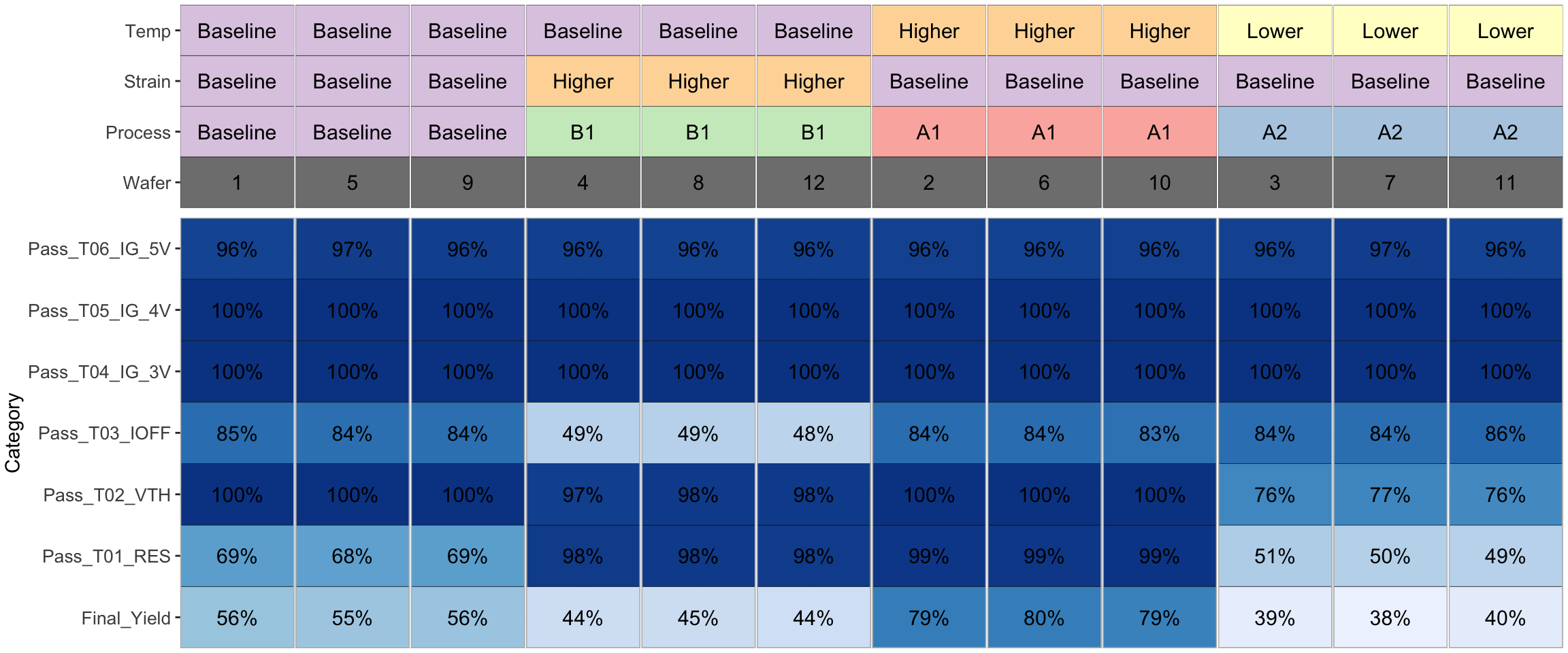
Statistical verification of process improvement
So far we have qualitatively observed that the Process-A1 improved parameters, but ideally we would like to use a more scientific way of determining if Process-A1 made a significant difference.
We can use an independent t-test to check if the means of two processes are statistically different for each test and the yield (column: “Pass”) using the following code.
These results are also consistent with the yield improvement observations from above.
# Include only the baseline process and process A1 for easier comparison.
df_Baseline_and_ProcessA1 <- subset(df_experiment, Process %in% c("Baseline","A1"))

# Exclude outliers T01_RES (T01_RES > 1000) to make sure results are not skewed by outliers
df_Baseline_and_ProcessA1 <- subset(df_Baseline_and_ProcessA1, T01_RES < 1000)

# Apply Welch Two Sample t-test to each column of interest
lapply(df_Baseline_and_ProcessA1[,grep('T0|Pass',colnames(df_Baseline_and_ProcessA1), value = T)],
       function(x) t.test(x ~ df_Baseline_and_ProcessA1$Process))
## $T01_RES
##
## Welch Two Sample t-test
##
## data: x by df_Baseline_and_ProcessA1$Process
## t = -40.075, df = 4230.8, p-value < 2.2e-16
## alternative hypothesis: true difference in means between group A1 and group Baseline is not equal to 0
## 95 percent confidence interval:
## -9.652142 -8.751786
## sample estimates:
## mean in group A1 mean in group Baseline
## 85.32041 94.52237
##
##
## $T02_VTH
##
## Welch Two Sample t-test
##
## data: x by df_Baseline_and_ProcessA1$Process
## t = -36.378, df = 4356.2, p-value < 2.2e-16
## alternative hypothesis: true difference in means between group A1 and group Baseline is not equal to 0
## 95 percent confidence interval:
## -0.07681972 -0.06896317
## sample estimates:
## mean in group A1 mean in group Baseline
## 0.7868826 0.8597740
##
##
## $T03_IOFF
##
## Welch Two Sample t-test
##
## data: x by df_Baseline_and_ProcessA1$Process
## t = -0.38863, df = 5124.9, p-value = 0.6976
## alternative hypothesis: true difference in means between group A1 and group Baseline is not equal to 0
## 95 percent confidence interval:
## -6.380262e-09 4.269163e-09
## sample estimates:
## mean in group A1 mean in group Baseline
## 6.092094e-08 6.197649e-08
##
##
## $T04_IG_3V
##
## Welch Two Sample t-test
##
## data: x by df_Baseline_and_ProcessA1$Process
## t = 0.95221, df = 5138.5, p-value = 0.341
## alternative hypothesis: true difference in means between group A1 and group Baseline is not equal to 0
## 95 percent confidence interval:
## -4.247193e-08 1.226970e-07
## sample estimates:
## mean in group A1 mean in group Baseline
## 1.499237e-06 1.459125e-06
##
##
## $T05_IG_4V
##
## Welch Two Sample t-test
##
## data: x by df_Baseline_and_ProcessA1$Process
## t = -1.8021, df = 5086, p-value = 0.07159
## alternative hypothesis: true difference in means between group A1 and group Baseline is not equal to 0
## 95 percent confidence interval:
## -1.931247e-06 8.128421e-08
## sample estimates:
## mean in group A1 mean in group Baseline
## 1.500591e-05 1.593090e-05
##
##
## $T06_IG_5V
##
## Welch Two Sample t-test
##
## data: x by df_Baseline_and_ProcessA1$Process
## t = 0.34045, df = 5146.5, p-value = 0.7335
## alternative hypothesis: true difference in means between group A1 and group Baseline is not equal to 0
## 95 percent confidence interval:
## -7.753414e-06 1.101228e-05
## sample estimates:
## mean in group A1 mean in group Baseline
## 0.0001526389 0.0001510095
##
##
## $Pass
##
## Welch Two Sample t-test
##
## data: x by df_Baseline_and_ProcessA1$Process
## t = 17.711, df = 4923.6, p-value < 2.2e-16
## alternative hypothesis: true difference in means between group A1 and group Baseline is not equal to 0
## 95 percent confidence interval:
## 0.1987538 0.2482310
## sample estimates:
## mean in group A1 mean in group Baseline
## 0.7926267 0.5691344Conclusions
In summary, this example demonstrates various data analysis, data visualization, and hypothesis testing techniques applied to a sample semiconductor test data-set.
Seshadri Kolluri
Data Scientist & Hardware Engineer
My research interests include data science, data visualization, machine learning, Gallium Nitride electronics, and semiconductor technology development.